Grid — the basics
The grid (.KCMLgrid$) is the workhorse control for
tabular data — the standard way to show a list of records. This first page builds
a simple, read-only stock list and makes its rows selectable. The other
cookbook pages then add editing & dropdowns,
colours & conditional formatting,
large datasets and row context menus.
Verified by execution on KCML 06.00.88 (KClient direct mode).
What it demonstrates
- Defining the grid (
.Rows,.Cols,.FixedRows) and setting column widths. - A styled heading row plus data rows.
- Making rows clickable (
LeftAction,LeftSelect) and handlingLeftClick(). - Reading the clicked row with
..CursorRowand..Cell(r,c).Text$.
The program
01000 REM demo_grid_basics - a read-only stock list with row selection
: DIM result, sv_r, sv_c
01010 - DEFFORM GridBasics()=\
{.form,.form$,.Style=0x50c000c4,.Width=480,.Height=250,.Text$="Grid - stock list",.Id=1024},\
{.lblInfo,.static$,.Style=0x50000000,.Left=10,.Top=10,.Width=460,.Height=10,.Text$="Click any row to select it.",.Id=2000,.Font=.UI},\
{.grid,.KCMLgrid$,.Style=0x50013030,.Left=10,.Top=26,.Width=455,.Height=150,.Id=1000,.Rows=7,.Cols=5,.FixedRows=1,.Font=.Mono},\
{.lblSel,.static$,.Style=0x50000000,.Left=10,.Top=184,.Width=460,.Height=10,.Text$="(no row selected)",.Id=2001,.Font=.UI},\
{.btnClose,.button$,.Style=0x50010001,.Left=385,.Top=205,.Width=80,.Height=14,.Text$="Close",.Id=1,.Font=.UI},\
{.paneStatus,.status$,.Width=480,.Style=0x50000000,.Text$="Ready"},\
{.UI,.dlgfont$,.Name$="Segoe UI",.Size=10},\
{.Mono,.dlgfont$,.Name$="Consolas",.Size=10},\
{.clrHdr,.color$,.Red=224,.Green=224,.Blue=224}
: + DEFEVENT GridBasics.Enter()
: REM column widths are a column-level property -> set on row 0
: .grid.Cell(0,1).ColWidth = 70
: .grid.Cell(0,2).ColWidth = 185
: .grid.Cell(0,3).ColWidth = 65
: .grid.Cell(0,4).ColWidth = 60
: .grid.Cell(0,5).ColWidth = 75
: REM the heading row is the fixed first row (row 1), shaded grey
: .grid.Cell(1,1).Text$ = "Part No"
: .grid.Cell(1,2).Text$ = "Description"
: .grid.Cell(1,3).Text$ = "On hand"
: .grid.Cell(1,4).Text$ = "Price"
: .grid.Cell(1,5).Text$ = "Category"
: FOR sv_c = 1 TO 5
: .grid.Cell(1,sv_c).BackColor = &.clrHdr
: NEXT sv_c
: REM data rows start at row 2
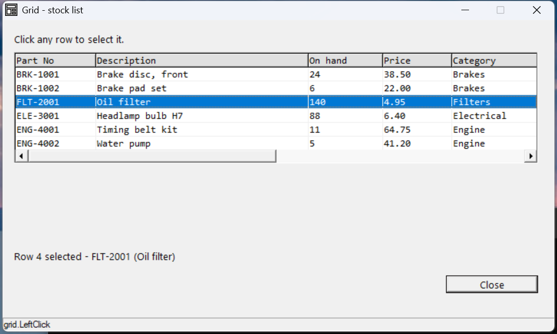
: .grid.Cell(2,1).Text$ = "BRK-1001"
: .grid.Cell(2,2).Text$ = "Brake disc, front"
: .grid.Cell(2,3).Text$ = "24"
: .grid.Cell(2,4).Text$ = "38.50"
: .grid.Cell(2,5).Text$ = "Brakes"
: REM ... rows 3-7: BRK-1002, FLT-2001, ELE-3001, ENG-4001, ENG-4002 ...
: REM make every data cell clickable, and select the whole row
: FOR sv_r = 2 TO 7
: FOR sv_c = 1 TO 5
: .grid.Cell(sv_r,sv_c).LeftAction = &.Click
: NEXT sv_c
: NEXT sv_r
: .grid.LeftSelect = &.Row
: END EVENT
: + DEFEVENT GridBasics.grid.LeftClick()
: IF ..CursorRow > 1 THEN DO
: .lblSel.Text$ = $PRINTF("Row %d selected - %s (%s)", ..CursorRow, RTRIM(..Cell(..CursorRow,1).Text$), RTRIM(..Cell(..CursorRow,2).Text$))
: END DO
: END EVENT
: FORM END GridBasics
01020 result = GridBasics.Open()
: $END
How it works
Cell(row, col) addresses every cell, and both row and column are 1-based.
Row 0 vs the heading row — the key gotcha (verified). Row 0 is not a
visible row; it holds column-level properties — ColWidth, Type$,
DropDown, and so on, which apply down the whole column. The visible heading
is the fixed first row (FixedRows=1 → row 1), whose text you set with
Cell(1,c).Text$. Shade it (BackColor) so it reads as a header. Data
therefore starts at row 2. This is why selectable-row code guards with
IF ..CursorRow > 1 — to skip the header.
Making rows clickable. Set LeftAction = &.Click on each data cell (do it in
a loop), and LeftSelect = &.Row so a click highlights the whole row rather than
a single cell. Without LeftAction, the grid won't raise LeftClick().
Reading the selection. Inside LeftClick(), .. is the grid, so
..CursorRow is the clicked row and ..Cell(..CursorRow, c).Text$ reads any
cell on it. Wrap text reads in RTRIM().
Automation note: KCML grid cells are not exposed to Windows UI Automation — only the grid container is. To drive a grid programmatically (e.g. for testing) you click by pixel position and verify via a label, the status bar, or a screenshot.
See also
- grid · grid cell — full reference
- Next: Grid — editing & dropdowns