Forms Designer - Working with Menus, toolbars and popup menus
The Menu editor is used to create and modify the menu bar and popup menus for the current form. There can be only one main menu but a form can have a number of named popup menus associated with it. By associating pictures with menu options a toolbar can be constructed which will be displayed under the main menu.
When editing a form in the Forms Designer you can add a Main Menu or a popup menu to the form by selecting the Tools|Menu Editor menu option, using the CTRL-M hot key or clicking on the Menu Editor icon on the toolbar  . The menu editor dialog is displayed (See below).
To add a new submenu to the menu bar you should first enter the menu name next you should click on the right arrow then enter the captions for the menu options. If the menu needs to contain sub menus then click on the right arrow again. To create a new main menu option the caption name should appear next to the left hand side of the menu listing. Use the left and right arrow keys to change the level of an option.
Separator lines can be inserted into the menu to break up the options into groups to improve readability. To insert a separator select the option that is to appear after the separator and click on the Insert button. This will insert a blank line into the menu, now click on separator to change the blank entry to a separator.
If the form has a status bar then text entered into the "Help Text" field for each option is automatically displayed in the status bar when the option is highlighted by the user.
Selecting the "Generate KCML Event" check box will automatically create an event handler in the program for the option.
To create a popup menu the check box titled "Use this menu as the main form menu" must be unchecked. Popup menus are used by the TrackPopup() method to place a popup menu onto either a KCML Picture button or a KCML Grid control.
Click on the dialog below or consult the explanatory table to find out more information about each option.
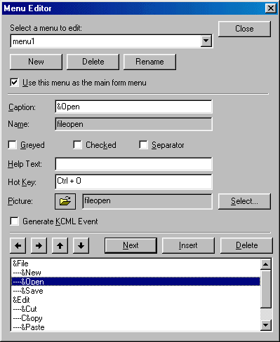
| Select a menu to edit | Select the name of the menu to be edited from the drop list of menus in the program. Note that there can only be one main menu bar which will be indicated by a tick in the checkbox. To add a new menu use the New button immediately below. |
|---|---|
| New | Invoke a dialog to add a new menu to the form. |
| Delete | Delete the selected menu from the form. |
| Rename | Rename the selected menu in the form. |
| Use this menu as the main form menu | Setting this check box will instruct the form to use this menu as the main form menu bar. Menus that don't have this option selected are used as popup menus that can be called by certain KCML Picture button and KCML grid control event handlers. |
| Caption | The text entered here will be used as the caption for the menu name or item. You can embed an & character before a hot key character as a keyboard accelerator. |
| Name | The name displayed here is the name of the programming object. The programming object can be used by the program to change the characteristics of the option. It must be unique within the particular menu. |
| Greyed | Tick this on to have the option disabled and greyed out when the menu is created. It can be later enabled under program control by use of the Enabled property e.g.
.menu1.fileopen.Enabled = TRUE |
| Checked | Tick this on to have the option shown with a tick. The tick state can be later toggled under program control with the Checked property. |
| Separator | Tick this on to insert a line separating parts of the menu. No name or caption is required |
| Help text | Text entered into this field is automatically displayed in the form's status bar (if present) when the option is highlighted by the user. |
| Hot key | Just press the required key that will act as a direct shortcut to the menu option. This will usually be a function key or a combination CTRL and a regular key, which will invoke the menu option directly e.g. CTRL+S is the convention for a Save option. For ALT combinations the preferred technique is to insert an & character before the required letter in the items caption text. |
| Picture | The name of an optional picture object already embedded in the form. This is optional and available only for the main menu bar. If used it will cause a toolbar consisting of a strip of small bitmap images to be displayed just below the menu. Clicking an image has the same affect as choosing the linked menu option. Use the Select button to browse for pictures already defined or to add new pictures. The pictures can be local to the client or held on the server |
| Select... | Use this button to invoke a picture browse dialog allowing the selection of an existing picture, a predefined stock picture or the addition of a new picture. |
| Generate KCML event | Ticking this on will cause the workbench to create an event handler for the menu item |
| Left | Moves the currently selected item back a level in the menu hierarchy moving it into its parent. |
| Right | Moves the currently selected item right a level in the menu hierarchy moving it into a submenu. |
| Next | Move the selection to the next item in the list. |
| Insert | Insert a new item into the list above the current one |
| Delete | Delete the currently selected item. |
| Menu list | This list displays all of the menu item available in the currently selected menu. Options closest to the left are main menus, the next level in are the individual options and sub-menus. The next level are options and sub-menus within the first level of sub-menus and so on. |