Forms Designer - Working with Grid Controls
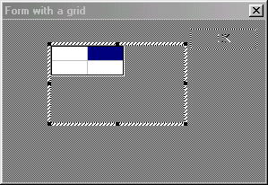
The grid control is possibly the most useful control available. It allows a table of cells to be placed on the form. Once displayed the user is able to click on individual cells, or select a whole row or column. The program can also reference individual rows, columns and cells.
To add a Grid control to a form click on the  icon on the controls palette. Mark an area for the grid on the form by dragging and releasing the mouse. The area occupied by the grid control may be bigger than the width and depth of the cells. You will then be prompted for some grid appearance parameters in the Add New Grid Dialog.
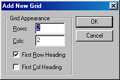
These are as follows:
| Rows | This parameter specifies the default number of rows that are to appear in the grid. |
|---|---|
| Columns | This parameter specifies the default number of columns that are to appear within the grid. |
| First Row Heading | If this check box is selected then each cell in the first row of the grid will appear as a button. |
| First Column Heading | If this check box is set then the first cell in each column will appear as button. |
Once the grid had been placed onto the form the overall style of the grid can be modified by changing the properties in the properties tab. For example you may wish to change the number of rows or columns, these can be changed by modifying the Rows and Cols parameters. If you will be allowing editing of cells, other than by data awareness, then you should set the ServerText property to TRUE to tell KCML to keep a copy of the grid on the server.
Using the Grid Editor
Once the grid has been placed onto the form, the grid editor can be called up by double left clicking on the grid which will switch the form into a grey color with only the gridcells in the original color. To leave grid editing mode press Esc. The following p
Once the grid editor is active, individual row, column and cell properties can then be set in the property list window. To modify the properties of an individual cell simply click on the required cell.
To select an entire row or a column, move the mouse pointer to the start of the row or column and the pointer should then change to a right or down arrow respectively. Click on the top of the row or column and the row/column should then be selected. You can then modify the properties for the selected row/column directly in the properties list.
To add or delete rows and columns, right click an appropriate cell and a context menu will appear with the following options
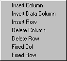
Fixed rows or columns do not scroll and can be used as headings.
Cell Types
To make it easier to format data within a Grid control various types are available by setting the Type$ property. For example, you may want an entire row or column to be formatted to display dates or numeric values etc. If formatting is not used then it is unlikely that columns of numeric information will line up nicely. Refer to the Type$ property for details of the available settings.
Note that grid cells can contain multiple lines of text using the multi-line string Type$ setting. If multi-line strings are to be displayed in a grid the LinesPerRow property must be set accordingly.
Changing the overall style of the grid
The FixedRows and FixedCols properties can be used to set the number of heading rows and heading columns respectively. Use Heading$ to set the caption for the heading.
The user cell selection method can also be specified for the whole grid, although in most cases this would be done within the grid editor or under program control. The cell selection method is specified with the LeftAction, RightAction, LeftSelect and RightSelect properties.
Sometimes it may be useful to insert either horizontal or vertical bold lines to break up the grid a bit more, these can be set for individual rows, columns or cells by setting the LeftLine and TopLine properties.
Other useful grid control properties
Appearance
RowHeight
ColWidth
DropDown
DropStyle
FixedRows
FixedCols
Heading$
Picture
VerticalLines
HorizontalLines
Useful KCML grid control event handlers
LeftClick()
RightClick()
LeftDblClk()
RightDblClk()